
Products, parts & variations
Bu içerik henüz dilinizde mevcut değil.
A configurator is built from three levels inside a project:
- Product — what the shopper configures. A project can hold several products, each a complete assembly with its own parts, relationships, opening camera and dimensions.
- Part — one configurable slot of the product: body, legs, cushion. Parts are what the picker lists.
- Variation — one choice for a part: walnut, oak, chrome. Selecting a variation swaps the part’s model (geometry, material, or both).
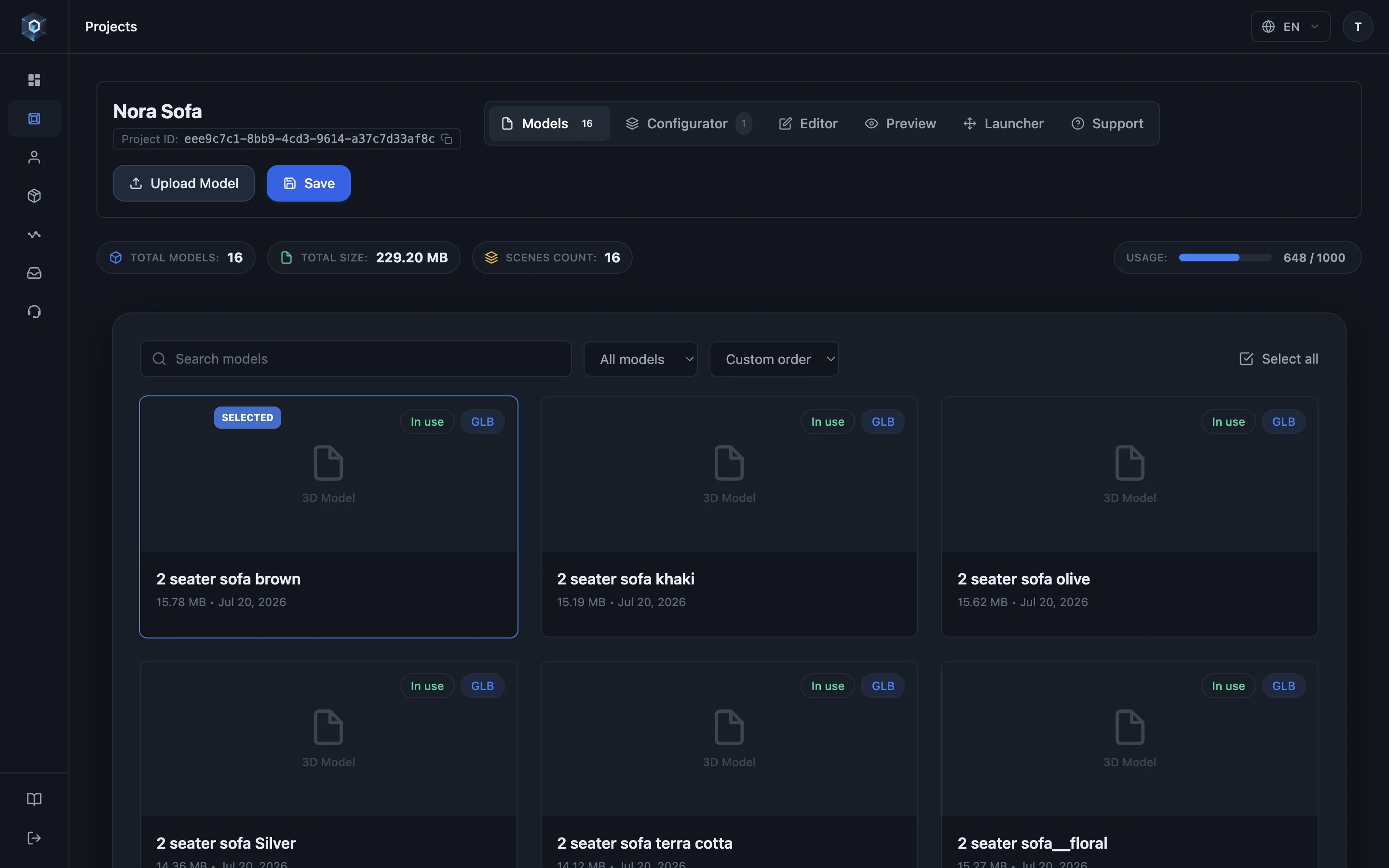
Configurator sekmesini açın — statik bir model burada yapılandırılabilir bir ürüne dönüşür.
Akışın tamamı bu — şimdi canlıda deneyin.
- Configurator sekmesini açın — statik bir model burada yapılandırılabilir bir ürüne dönüşür.
- Bir proje birden fazla komple ürün barındırabilir — her birinin kendi parçaları, ilişkileri ve açılış görünümü olur.
- Çoğalt, ürünün tamamını klonlar — her parça, varyasyon, grup, kural ve kamera — bağımsız bir kopya olarak.
- Parçalar ürünler arasında da taşınır: Kopyala bir kopya bırakır, Taşı parçayı gönderir. Base parça ürününü sabitlediği için yalnızca kopyalanır.
- Parçalar yapılandırılabilir yuvalardır — gövde, ayak, minder. Seçim paneli tam olarak bunları listeler.
- Part name sizin çalışma etiketiniz; Picker title ise ziyaretçilerin seçeneklerin üstünde okuduğu başlık.
- Varyasyonlar seçeneklerdir — her biri bir modele bağlıdır, seçilince görüntüleyicide o model devreye girer.
Adding parts
Section titled “Adding parts”In the project’s Configurator tab, add a part and assign models to it. Each variation points at one uploaded model — the configurator swaps between them when the shopper picks.
Two practical rules the panel enforces:
- A part needs 2+ variations to show a picker. A part with a single variation is simply always present — useful for fixed elements of an assembly that never change.
- The first part is the product’s base — see Base part & assembly.
Name the part for yourself, not for the shopper: Part name is your working label in the
panel, while Picker title is what visitors read above the swatches (leave it empty and
the part name is used). Modelling names like body_v2 can stay exactly as they are —
see Picker modes & presentation.
Selling in more than one language? Open Translations under any shopper-facing name —
Picker title, variation label, group name, product name, quote button — and enter the
English, Turkish and Russian versions. The published viewer picks the one matching its
language (?lang=), and any empty field falls back to the default name.
Variations
Section titled “Variations”Per variation you set:
- Label — what the shopper reads (Walnut, Sea Teal).
- Model — the uploaded file this choice renders.
- SKU — the identifier your store receives when this variation is selected. Optional for showcases, required per sellable variation for commerce — see SKU & pricing fields.
- Accent light power (base part only) — a multiplier on the product’s accent light, so a dark finish can be lifted without brightening the others — see Configurator lighting.
The default variation of each part defines the configuration shoppers see first —
and what reset() returns to in embedded stores. Set it with the ⭐ next to a variation
in the scene tree. Clicking the current default’s star clears it, which makes the part
optional: it is not loaded into the opening scene and shows no pre-selection — shoppers
opt in by picking a variation. (The base part always keeps a default.)
The opening scene loads only the starred defaults — in the published viewer and in the editor alike — so large catalogs open fast. Optional parts stream in the moment you select them in the editor or a shopper picks them in the viewer.
Several products in one configurator
Section titled “Several products in one configurator”Use a second product when the alternatives are complete products, not choices within one — two stove models, two sofa families, a table range and a chair range. Each product keeps its own parts, link and show/hide groups, rules, picker order, opening camera and dimensions, so the two never interfere.
The Products strip sits at the top of the configurator’s left rail:
- + adds an empty product.
- The active product is editable inline — type to rename it, and set shopper-facing translations under the gear icon (Product name).
- Duplicate (copy icon) clones the whole product — every part, variation, link and show/hide group, rule, camera and dimension override — as an independent copy. The fastest way to build a second product that shares most of its structure.
- Delete (trash icon) removes a product and its parts. The last product cannot be deleted; a configurator always holds at least one.
Everything below the strip — parts, relationships, Setup Check — always applies to the active product. Click another product to edit it.
Switching products in the viewer
Section titled “Switching products in the viewer”Shoppers switch with the product headers in the picker. Choices carry over where they match: a part with the same name whose option has the same key (URL key, SKU or label) keeps its selection; everything else opens at the product’s defaults. While the new product loads, the panel is dimmed and ignores clicks.
All products are drawn at one scale, taken from the first product: a one-seater next to a two-seater of the same sofa appears at its real size relative to it, and AR shows both at real size. The camera stays on the opening frame and only dollies out along it when a larger product would not fit; switching back lands exactly on the opening frame. A product with its own opening camera lands on that camera.
The share link records the product as product=<key>, derived from the product name
(product=one-seater), next to the selection — a link opened later lands on that product
with those choices. The first product is the default and is left out of the link.
Moving parts between products
Section titled “Moving parts between products”Open a part and use Send to another product at the bottom of its panel:
- Copy places an independent duplicate in the target product; the original stays put.
- Move relocates the part. Because link and show/hide groups live inside a product, moving detaches the part from the groups it belonged to — the panel warns you first and lists what it will detach. Rebuild the equivalent grouping in the target product.
- The base part can be copied but not moved: it anchors its product’s assembly (see Base part & assembly).
Settings that are configurator-wide, not per product: picker mode, the quote-request button, and the project’s lighting and scene.
What this looks like publicly
Section titled “What this looks like publicly”The published picker lists each part with its variations as labeled swatches. Selection state is written to the URL, so any configured state is shareable and restorable — see Publishing & sharing.
When the configurator holds several products, the panel lists them as headings above the options. Shoppers open a heading to switch: the previous product leaves the scene, the new one loads with its own opening framing, and only the active product’s models are ever downloaded — a second product does not slow the first one down.
- Multi-part placement and the base part: Base part & assembly
- Make parts change together: Link groups
- Offer alternative sets: Visibility groups