
Embed quick start
Это содержимое пока не доступно на вашем языке.
The embed is a standard web component: one script tag, one element, zero dependencies, 3.4 KB gzipped. It drops into React, Vue, Shopify Liquid or plain HTML without touching the rest of your page.
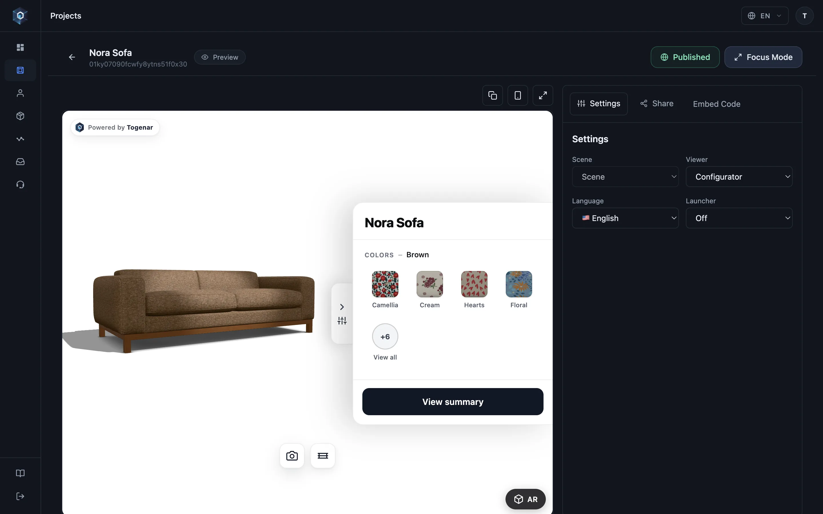
Откройте вкладку Embed Code — интеграция без отдельного проекта разработки.
Вот и весь процесс — попробуйте вживую.
- Откройте вкладку Embed Code — интеграция без отдельного проекта разработки.
- Выберите тип встраивания, подходящий вашему макету страницы.
- Этот фрагмент — вся интеграция: вставьте его на страницу товара, и конфигуратор заработает на вашем сайте.
- Скопируйте одним кликом — встраивание всегда показывает последнюю опубликованную версию проекта.
1. Install
Section titled “1. Install”Two ways in. They load the same component — pick whichever matches your stack.
Script tag — no build step
Section titled “Script tag — no build step”For Shopify Liquid, WooCommerce, Webflow or any plain HTML page:
<script type="module" src="https://model.togenar.com/embed/togenar-embed.js"></script>
<togenar-embed  id="tg"  project="YOUR_PROJECT_ID"  configurator  aspect="1/1"></togenar-embed>
npm — for bundled apps
Section titled “npm — for bundled apps”For React, Vue, Svelte, Next.js or anything with a build step:
npm install @togenar/embedimport '@togenar/embed';The import registers the custom element — that single side-effecting line is the whole
API. Import it once, at your app’s entry point, then use <togenar-embed> anywhere in your
markup. TypeScript definitions ship with the package, so select(), getSkus() and the
element’s attributes all autocomplete, including in JSX.
Source and issues: github.com/Togenar/togenar-embed.
On Shopify? The Shopify connector wires prices, stock and the cart button in the same paste.
2. Point it at a project
Section titled “2. Point it at a project”YOUR_PROJECT_ID is the ID of a published project — click the Project ID chip
under the project name in the editor to copy it, or take it from the Share drawer’s embed
snippet. Unpublished (draft) projects only render with an owner preview token
(see the preview attribute).
That’s the whole install. The built-in option panel, configuration summary, share link and AR button ship with it.
3. Size it
Section titled “3. Size it”Two sizing modes — pick one:
<!-- Aspect-ratio box (default 16/9): --><togenar-embed project="…" configurator aspect="1/1"></togenar-embed>
<!-- Fixed height: --><togenar-embed project="…" configurator height="520px"></togenar-embed>
The element is display: block; width: 100% — it fills whatever container you give it.
4. Common variants
Section titled “4. Common variants”<!-- Viewer only (no option picking): drop the `configurator` attribute --><togenar-embed project="…"></togenar-embed>
<!-- Turkish UI --><togenar-embed project="…" configurator lang="tr"></togenar-embed>
<!-- Device-adaptive AR launcher page instead of the inline viewer --><togenar-embed project="…" mode="launcher"></togenar-embed>
<!-- Headless: hide the built-in panel, drive everything from your own UI --><togenar-embed project="…" configurator picker="off"></togenar-embed>Headless mode keeps the full configuration engine and Host SDK running — see Build your own UI.
Next steps
Section titled “Next steps”- Every attribute, explained: Attributes reference
- React to shopper selections and wire your cart: Add to cart
- Lock the embed to your domains: Domain allowlist
- Languages and AR behaviour: Localization & AR